

Welcome to this blog post about how I created my latest design, “My Cardinal Home”. It is done on 19×24 inch Bristol Paper, and I hope this post serves to help inspire others as well as teach them how to make very beautiful and vibrant designs with time and patience.
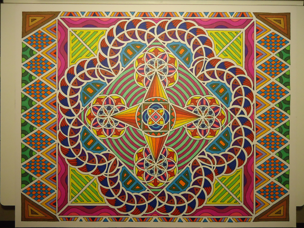
So here is the final design just so we have a reference on what we are working towards:
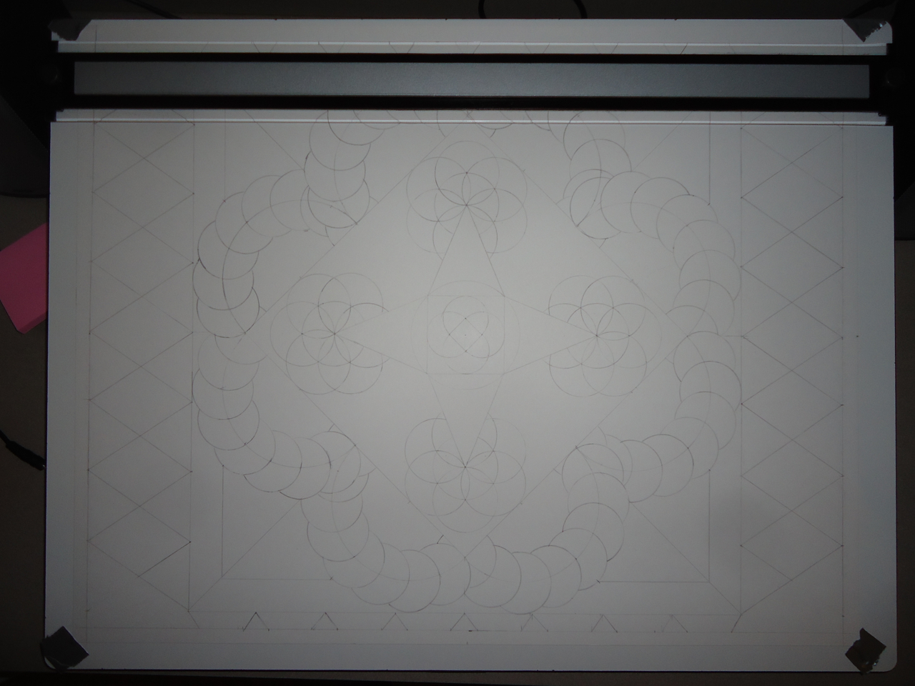
So where did I even start in coming up with this design? Well, my tools initially were a straight edge, a compass, a triangle, a pencil, and some imagination. I had something in mind that I wanted to put my own spin on already, and just sat down for a couple afternoons and figured it out. I started from the center, and proceeded to work my way out to the edges. Surprisingly, you can use a compass and ruler to make some pretty interesting and overlapping patterns! In the end, I put about 6 hours worth of work into coming up with the outline below:
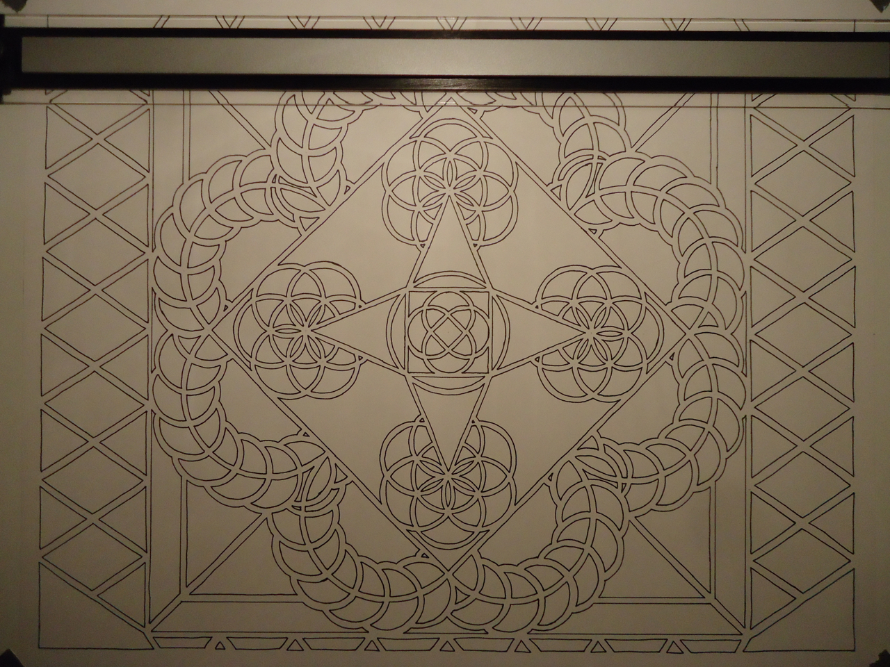
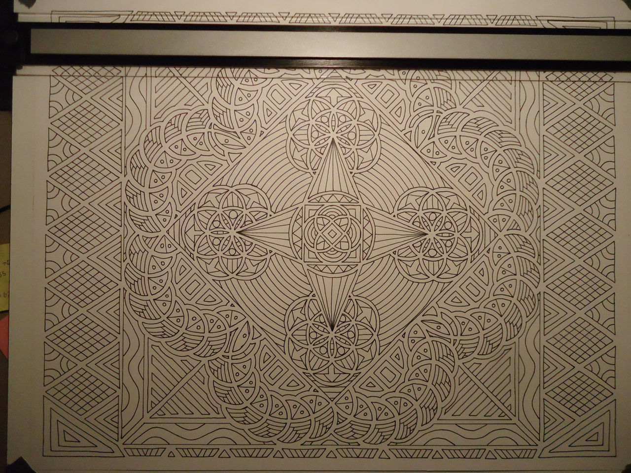
The next step is the sharpie marker outline. Again, working my way from the center out, I outlined the insides of each pencil shape I created. The marker never touched the pencil lead one time, instead I tried to stay about 1/8-1/4 inch inside of the borders. This creates a really nice looking buffer effect. At this point I really needed to be careful outlining the borders, because one slip up and it was game over. I chose to do all of this free hand because A) I wanted that whole freehand organic look/feel and B) Using a ruler, if you mess up with your placement a tiny bit it looks really off, and there is no going back. It took me about 5.25 hours to do the borders, and here is the end result:
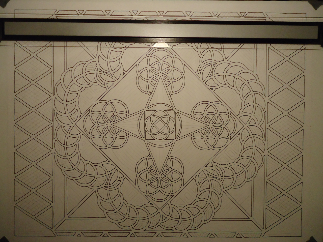
The next step to do is draw all of the patterns within each of the shapes. On smaller pieces like I have done prior I have done this step free hand and in sharpie, but considering I had put over 11 hours into this thing already I really didn’t want to mess it up, so I used pencil. I played with lots of different designs, some mirroring each other, others exact replicas, but I always try to keep the same shapes or set of shapes that make up the particular pattern uniform in their respective ways. I also tried to never use the same pattern twice for each section I wanted. I think there were twenty different patterns in the end, and it took me about 4 hours of work to complete.
You would like to think I would be on the home stretch right now, with the hardest parts over with right? Wrong. The final stage in coloring all of these shapes in is very tedious, because I literally cannot screw up any of the shapes at all. I not only have to worry about the white gaps that I do not want to get color in, but I also cant slip into the next section either because it will ruin that particular color combination for that single shape.
I love using extremely bright and vibrant colors, to the point where it seems to overwhelm the senses because everything you look at seems to be catching your eye. I want everything to make everything pop out, (you know?) while still looking nice as a whole. One goal I had in mind was to use all the different prismacolor markers I had at my disposal (24 pack for now), which I am pretty sure I managed to by the end of it.
Lots and lots of time was spend on coloring this thing in, but I think in the end it was worth it. Up to this point I had spent so much time with the piece that I already had in mind the name and the major color schemes I wanted, but sometimes filling in the gaps was a bit difficult. I worked from the center out once again, and coloring took about 17.25 hours to get my final result.
“My Cardinal Home” is 19×24″, and my goal is to have this available in both posters and canvases for anyone interested. When I have time and have set up the proper printing channels, there will an an announcement and I will stand up the Shop right here on this website so you can purchase this and maybe some of my smaller designs. I’m not quite sure what to do with them yet (10×12 I think they are). Otherwise I plan on continuing to come up with bright and colorful designs using the 19×24 setting, so stay tuned for more to come!
